Embedded Moments Design Guideline
Navbar Labels
Color Schemes and Applications
Navbar labels are the textual elements used for menu items. They can be in both light and dark colors.
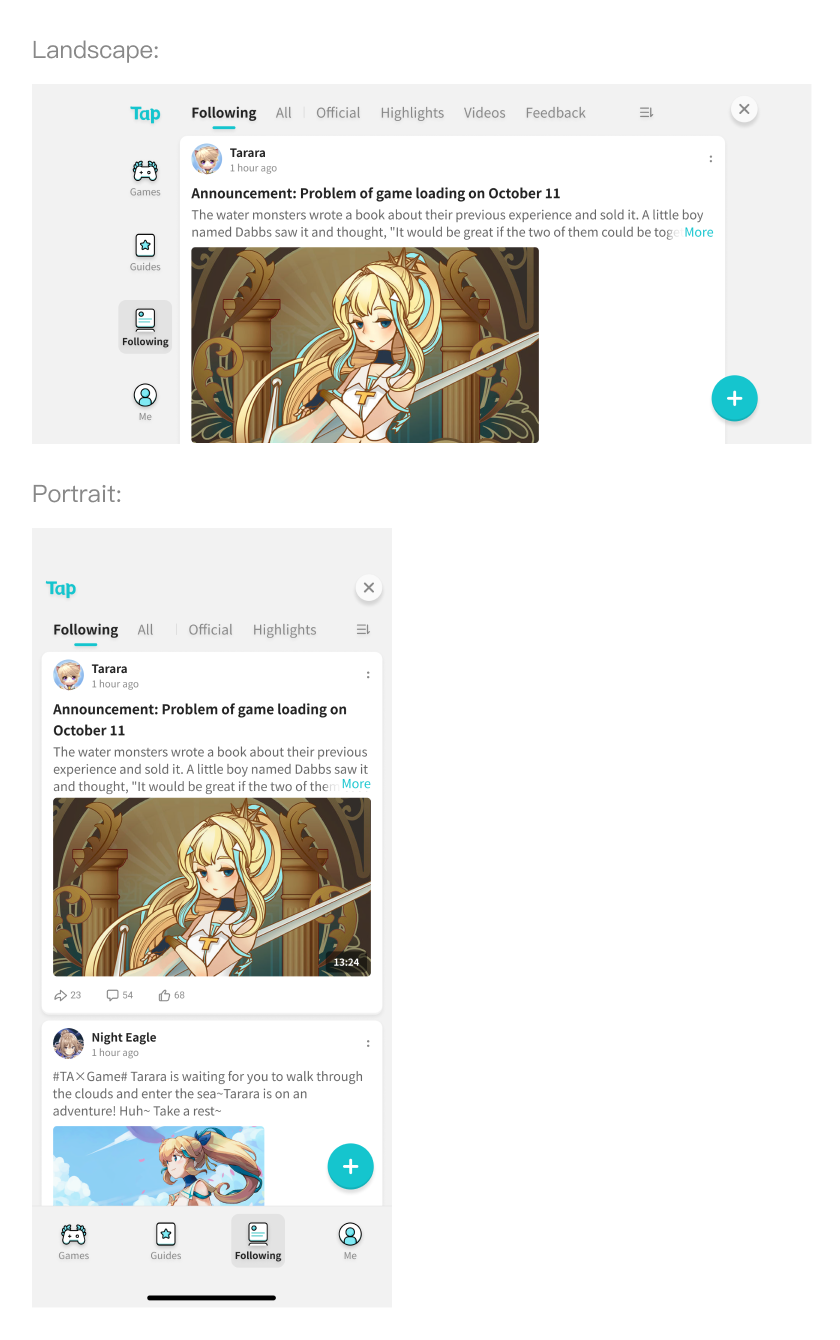
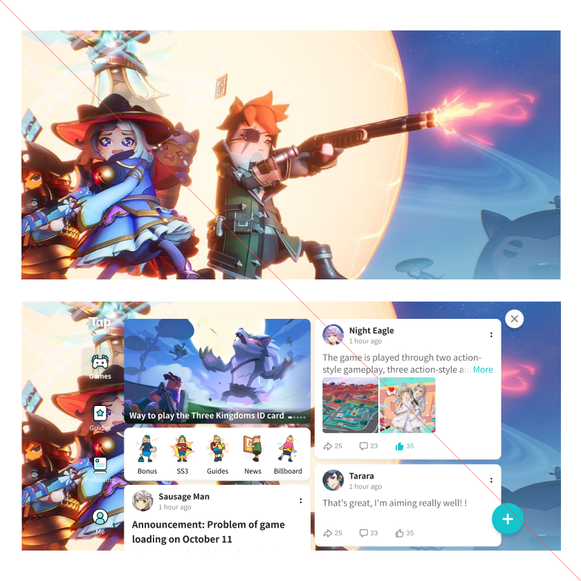
Navbar labels appearing in the main menu as icon labels and the logotype
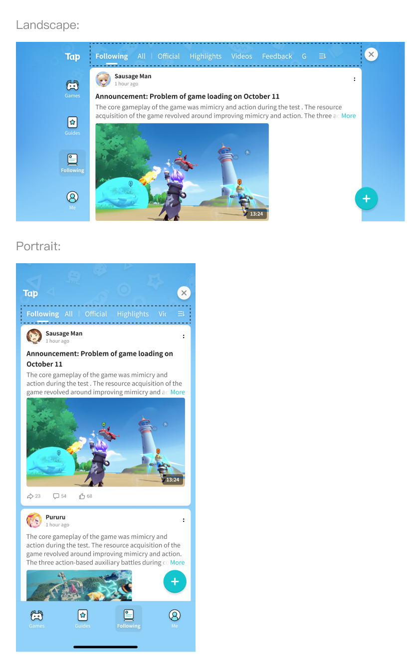
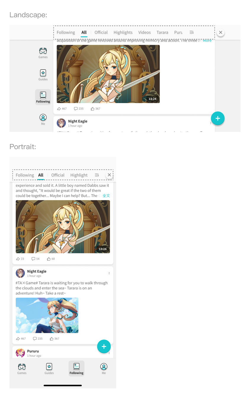
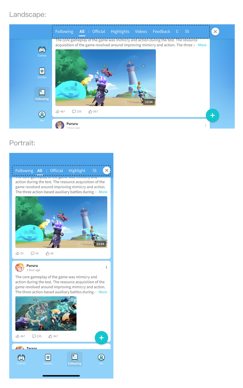
Navbar labels appearing in the tab list as tabs and the “sort” icon
Navbar labels appearing in the tab list as tabs and the “sort” icon
Contrast Is Important
The more contrast you set between the text and the background, the more legible the text will be. If you pick a light background for your page, you should set your text in a dark color, and vice versa.
Do
Don’t

Do

Don’t
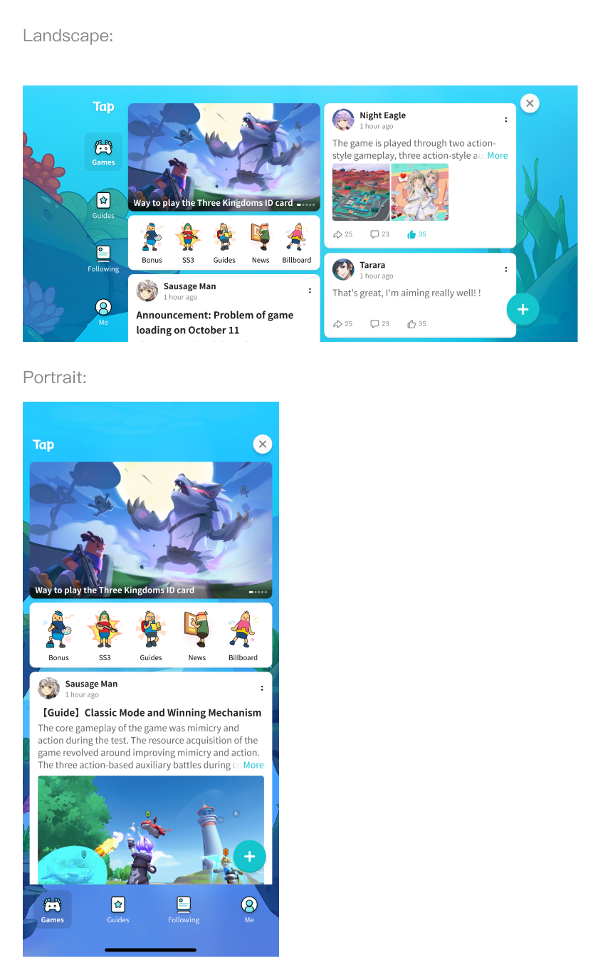
Backgrounds
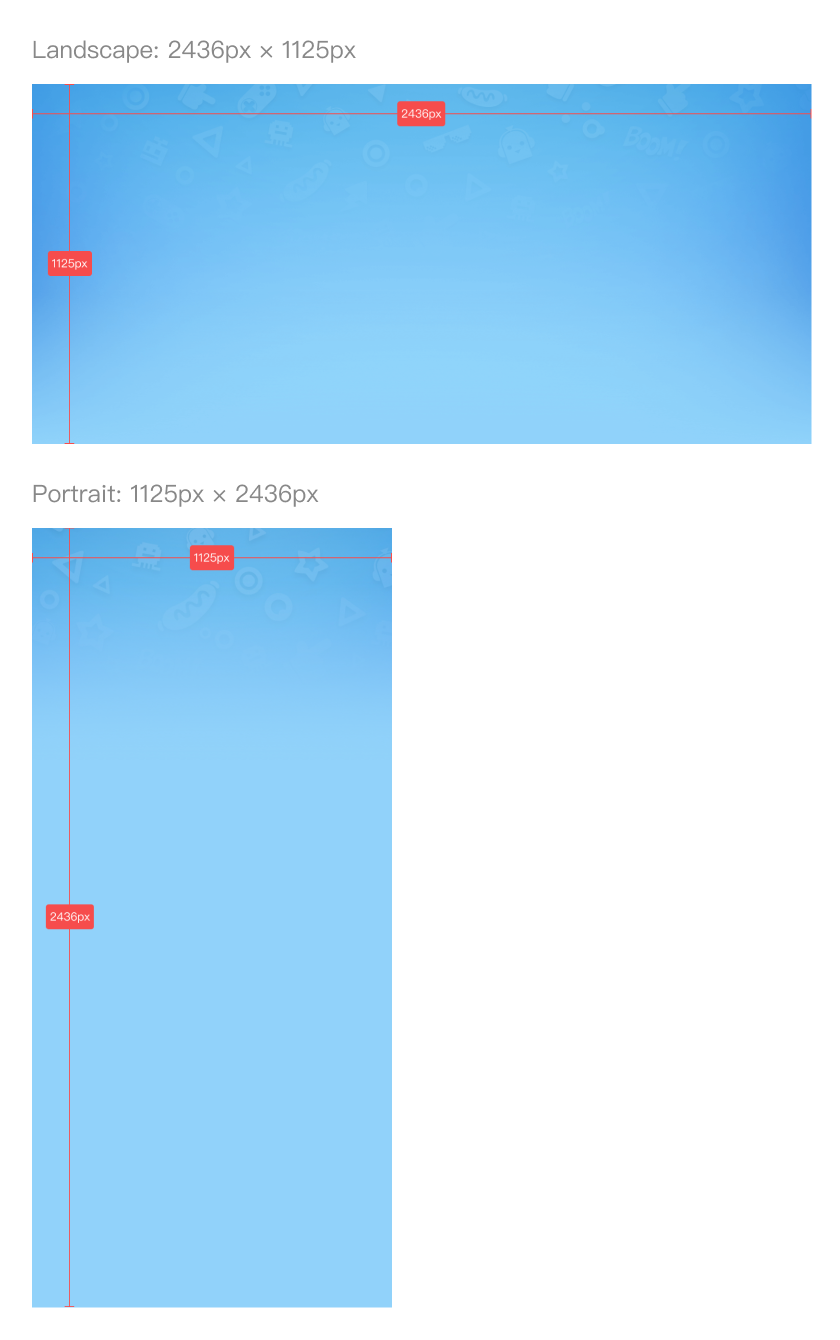
Background Sizes
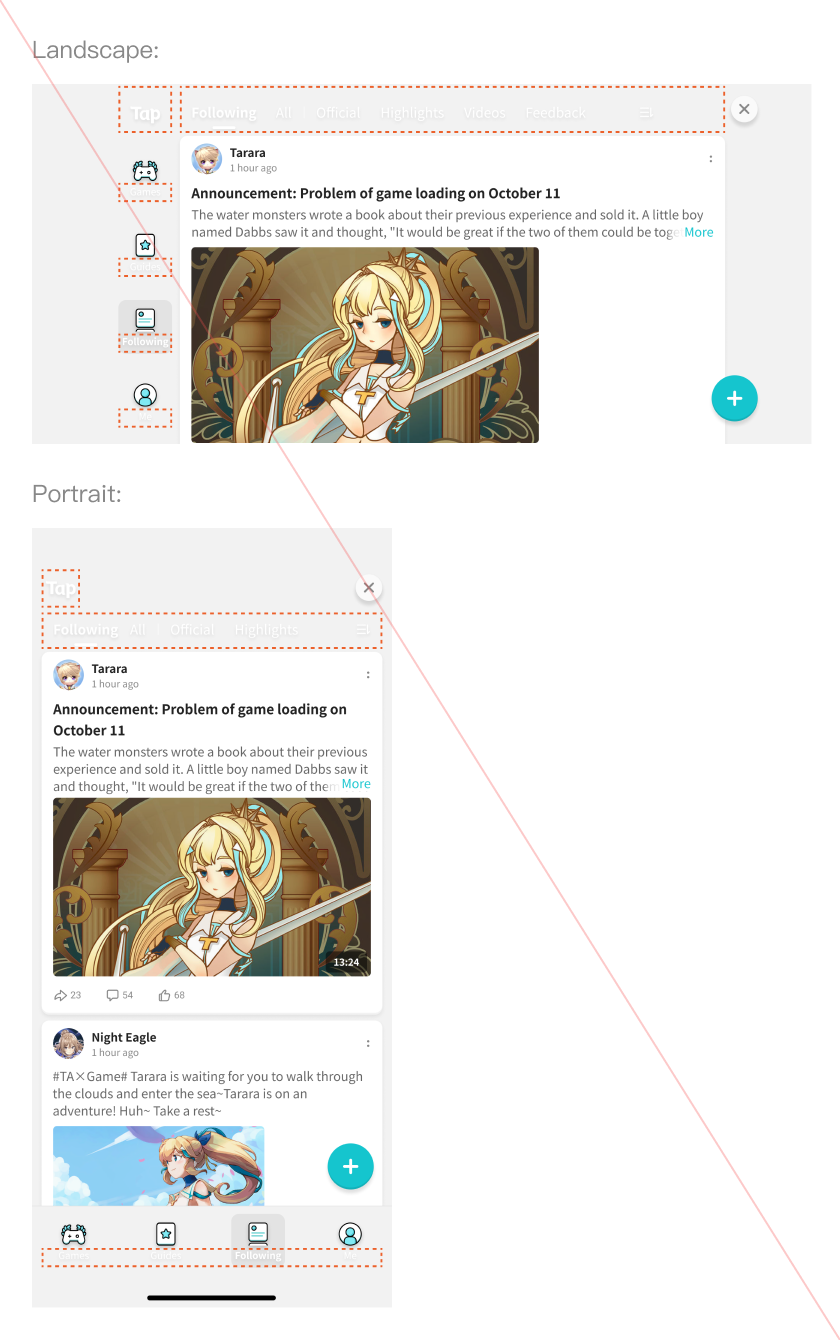
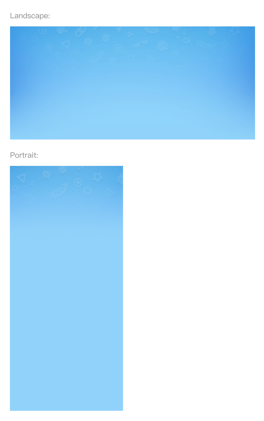
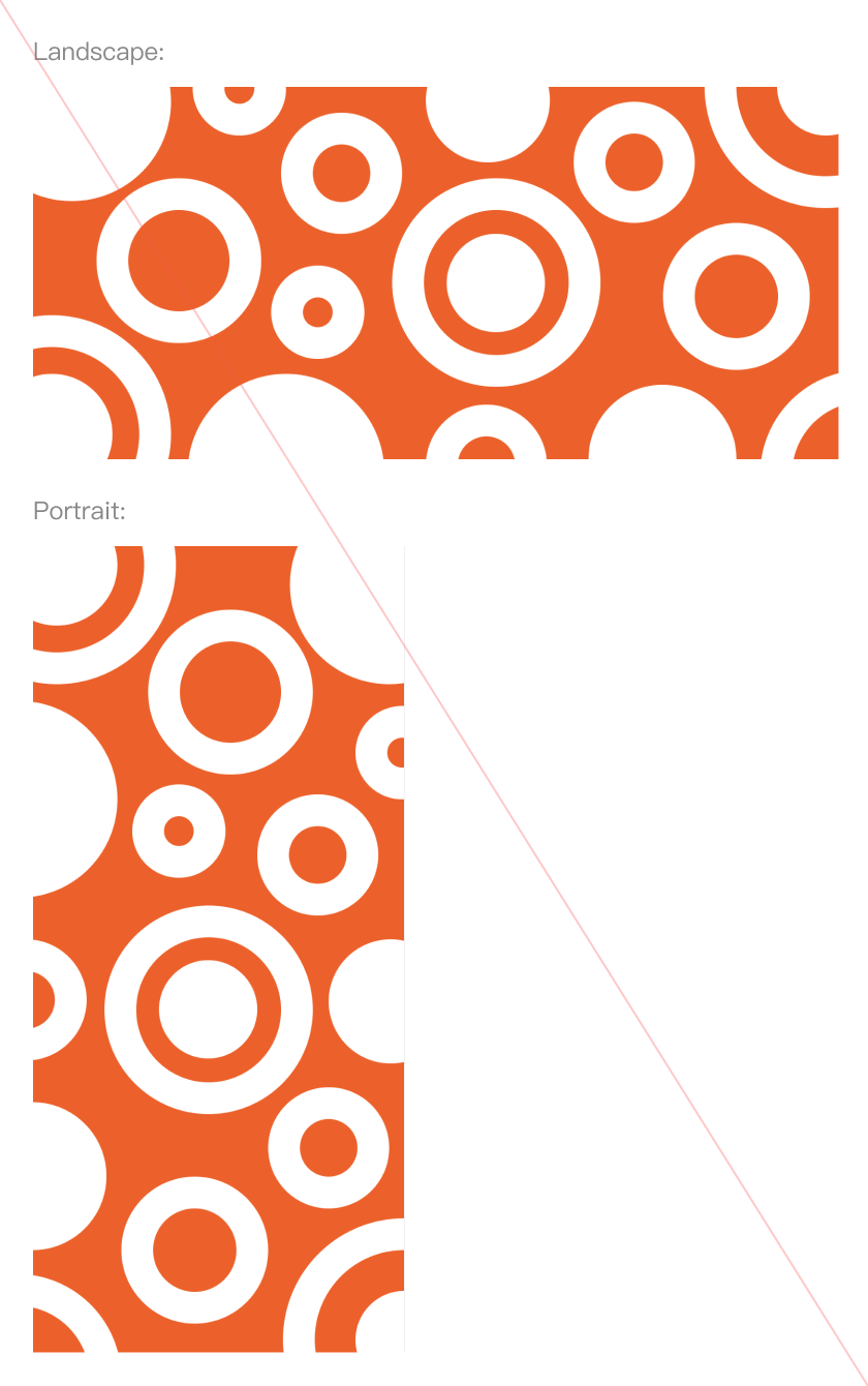
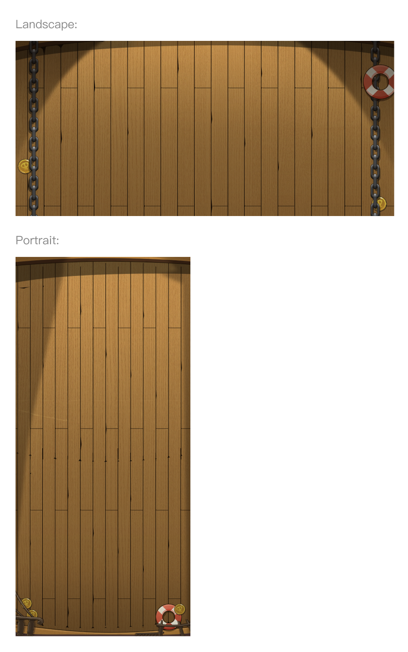
Embedded Moments can be displayed in both landscape and portrait modes. This means that you need to provide two background images for your game, one for each orientation.
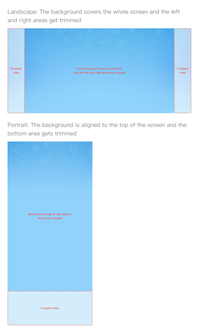
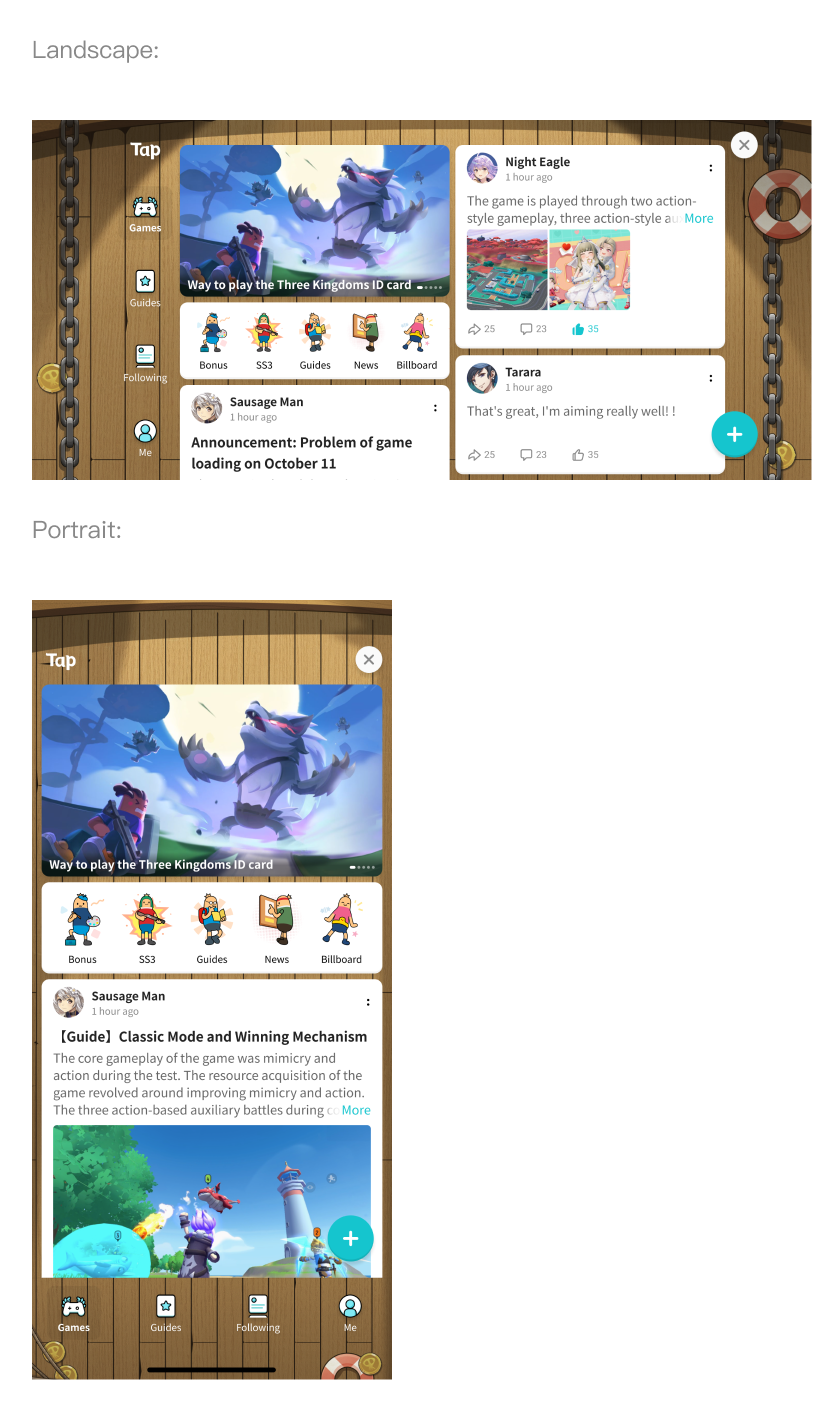
Cropping Backgrounds
When Embedded Moments is opened on a device with a short screen, the background image will be cropped to fit the screen.
Designing Background Images
Style
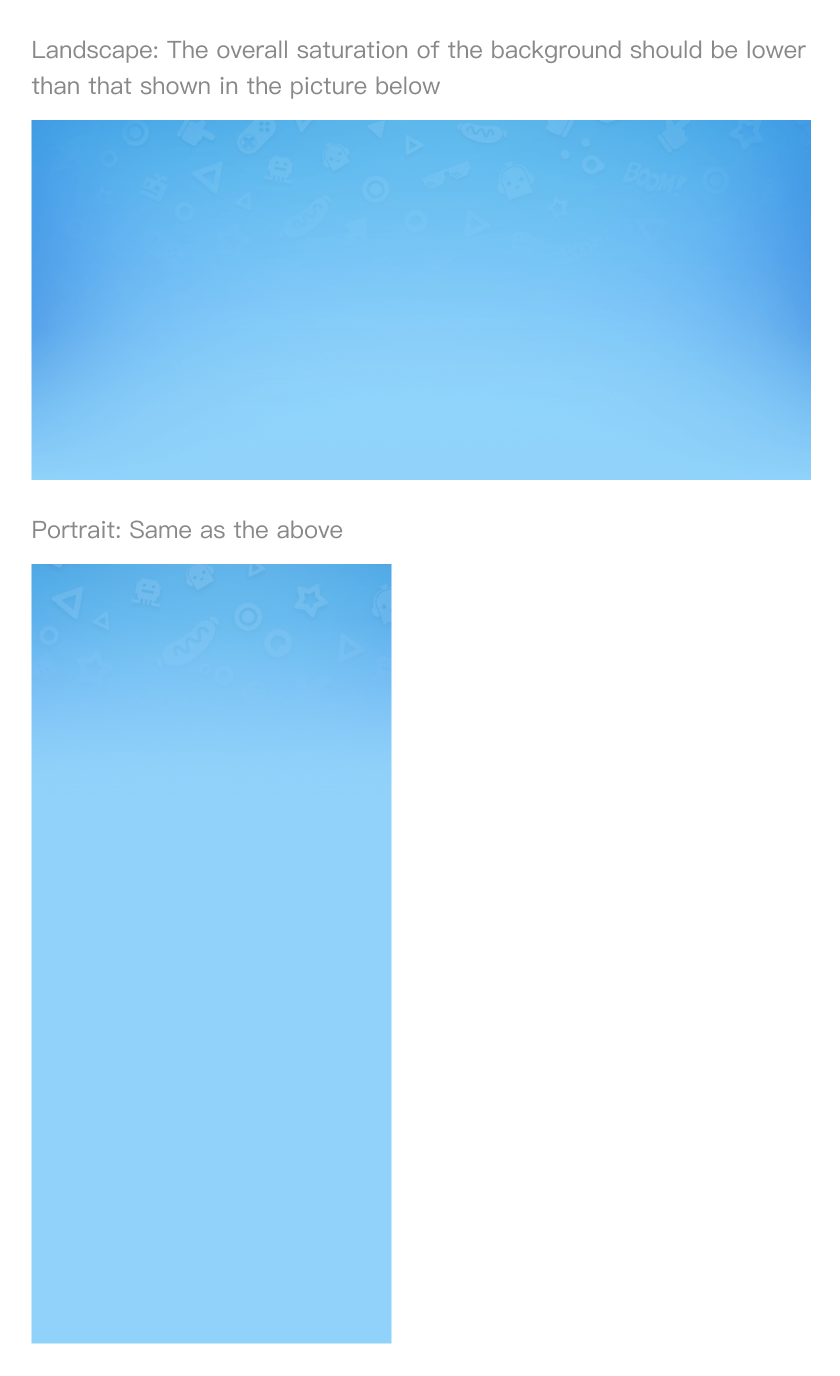
The background image shall not be too prominent that it takes the user’s attention away from the main content. Therefore, we suggest that you add simple patterns on the background and keep the contrast within the background to a minimum.
Do
A background that doesn’t catch the user’s attention
- Fewer colors
- Low contrast between the foreground and the background
Don’t
A background that catches the user’s attention
- Too many colors
- Too much contrast between the foreground and the background
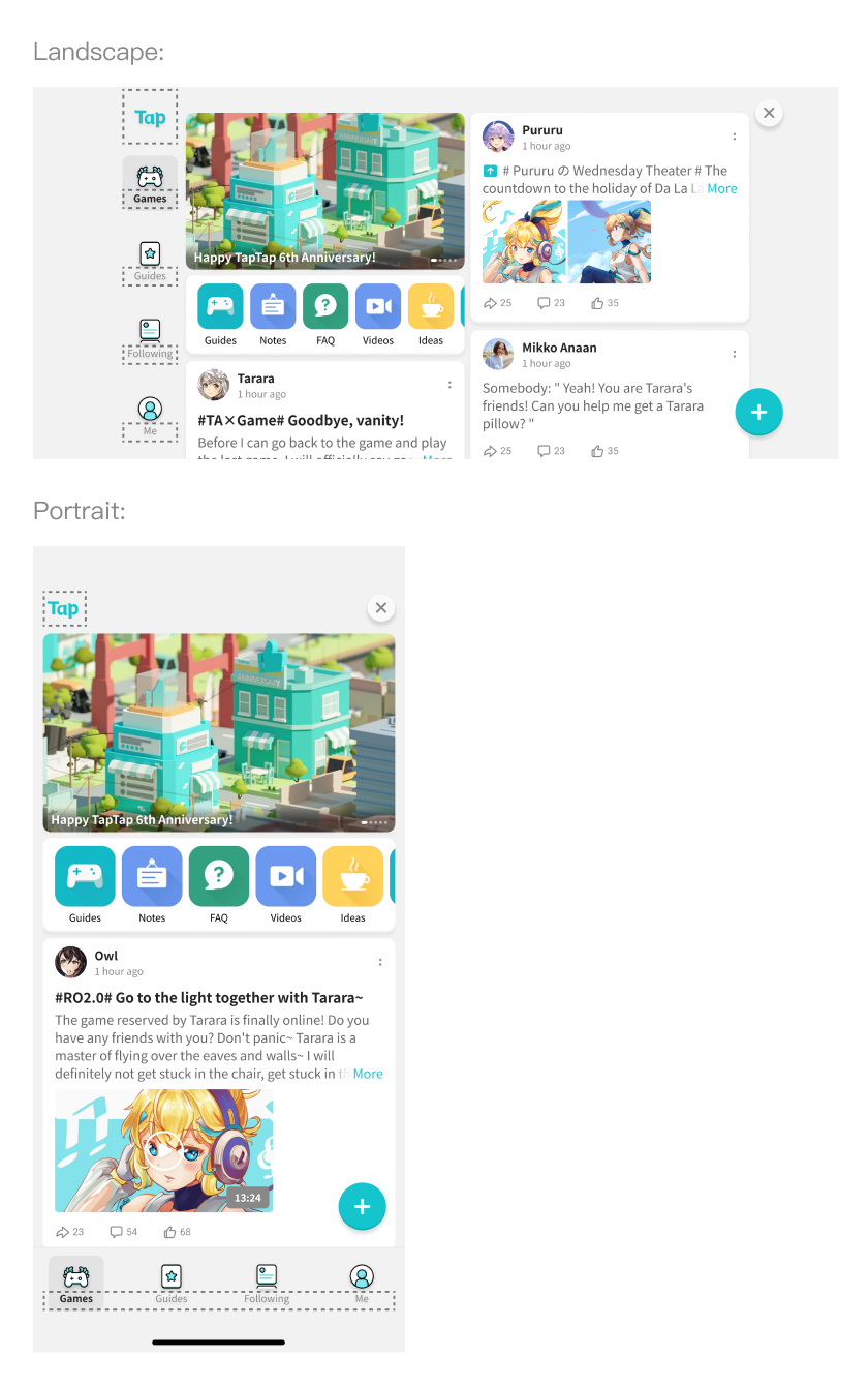
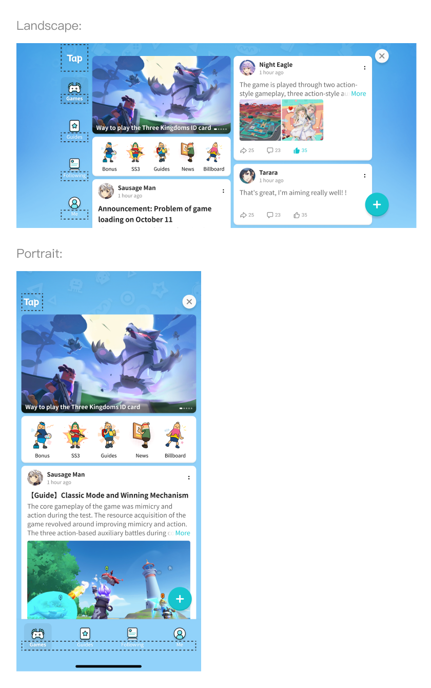
What to Place in the Background
You may add patterns or illustrations to the background as long as they don’t get too much attention from the user.
Patterns with low saturation
Do
- Simple patterns with low contrast against the background
Don’t
- The contrast is too strong
Illustrations with low saturation

Do
- Illustrations with low saturation give the user a feeling of tranquility
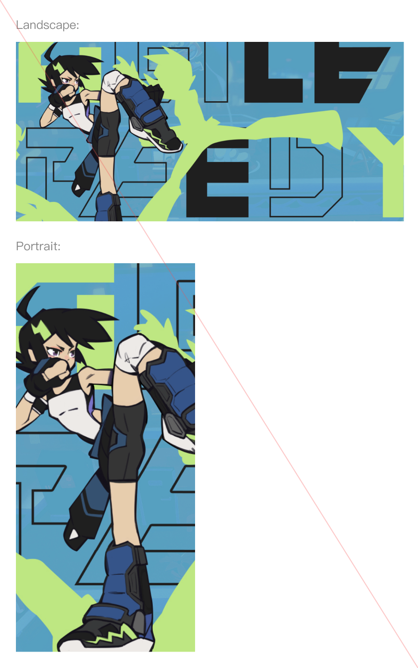
Don’t
- The contrast is too strong
- The illustration is too complex
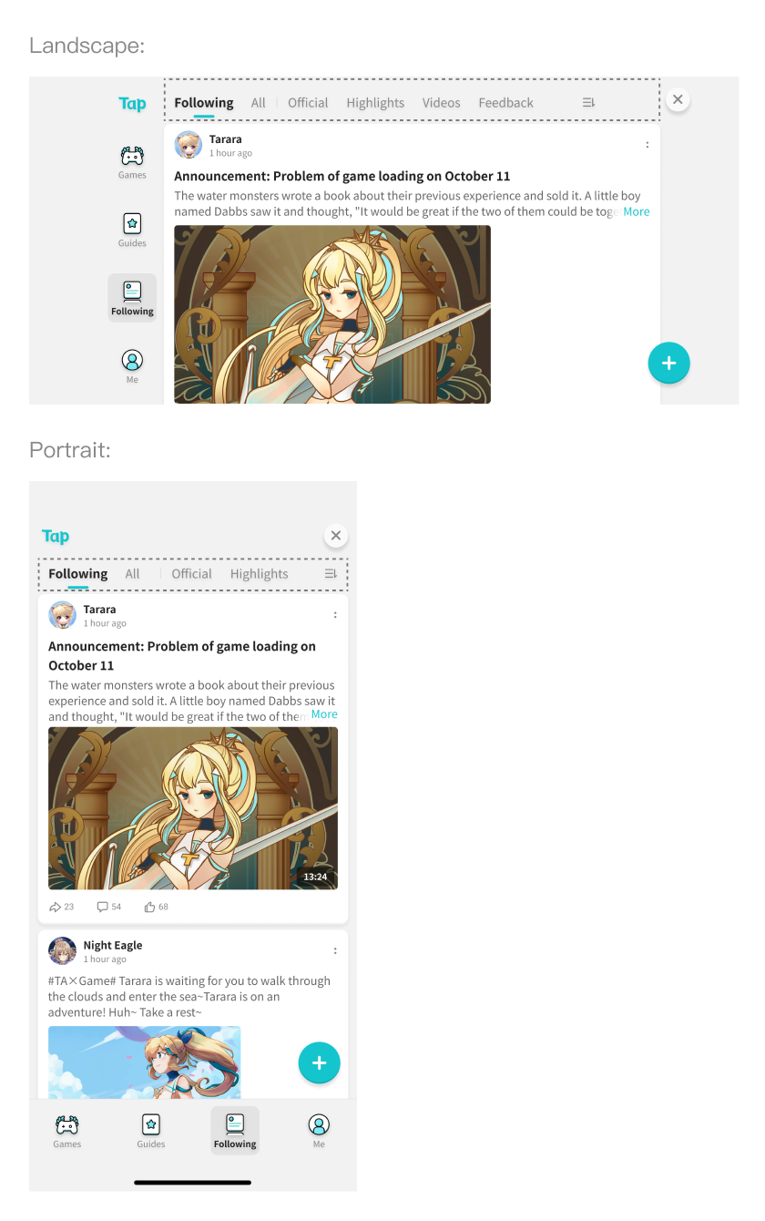
Simple background with limited decorations
Do
- Limited use of decorations

Don’t
- Cluttered decorations
- Decorations occupy too much space
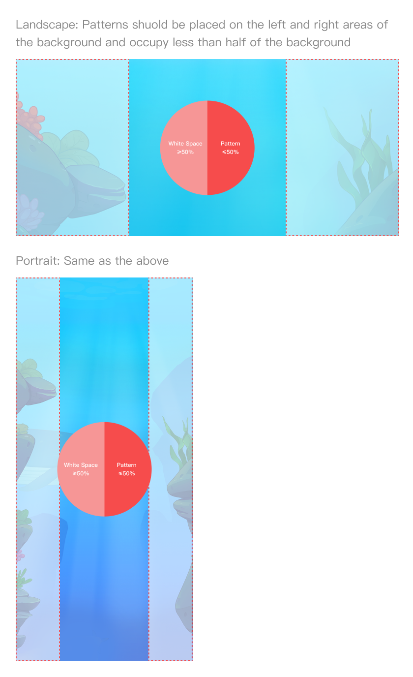
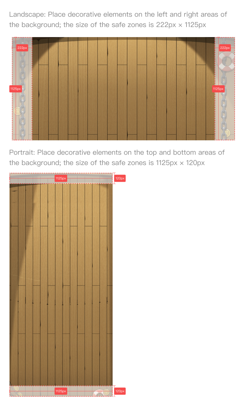
Safe Zones
To ensure that the entirety of the illustrations in the background can be seen by the user, please keep the illustrations within the safe zones defined below.
Patterns with low saturation
Illustrations with low saturation
Simple background with limited decorations
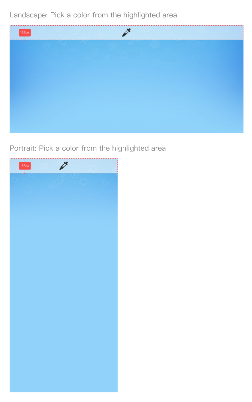
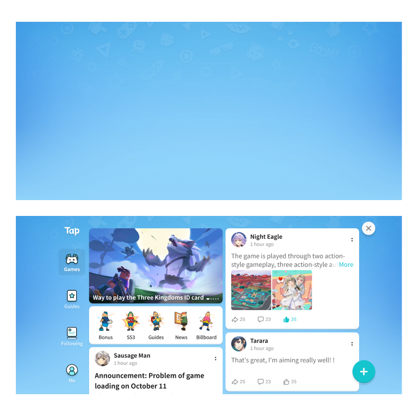
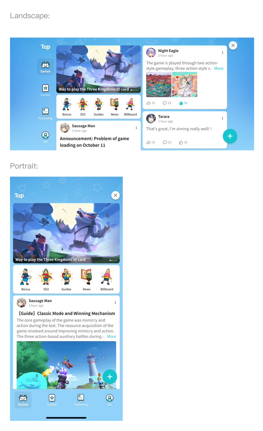
Background Color of the Sticky Tab List
You can set a background color for the sticky tab list. The tab list will fit well with the rest of the UI if you pick the color from the top area of the background image.