TapTap Login Button Design Guideline
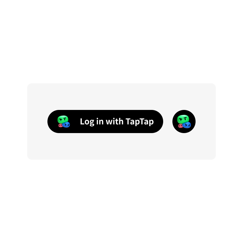
Types of Login Buttons
Icon
Pill
Icon
Composition of information
The icon is consisted of the TapTap logo and a background.
Button Shape
The default shape of the button is circle. It can be changed to a square with rounded corners to match the appearance of other in-game buttons.
Circle

Square with rounded edge

Button size
The default size is 40*40 pt. Please make sure that the aspect ratio of the icon is always 1:1.
Button margin
The materials in the downloadable resource packs already contain the correct amounts of padding. Please do not cut them out or add any extra padding.
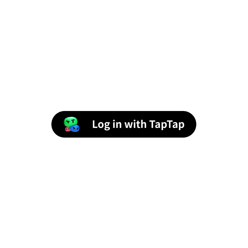
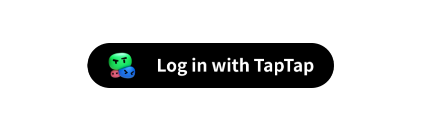
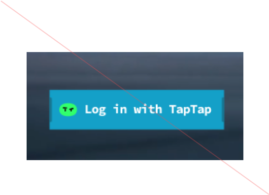
Pill
Composition of information
The icon is consisted of the TapTap logo, text, and a background.

Do
The TapTap logo and text
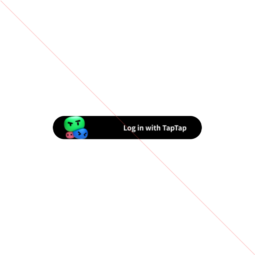
Don't
Do not cut the brand logo. Avoid stretching any elements on the button.
Rounded corners
Defaults to the maximum radius (pill). The radius can be adjusted to match the appearance of other buttons in the game interface.
Pill
Square with rounded corners

Button size
The default height is 40pt and the button width varies depending on the length of text in different languages.
Button text
The recommended text is "Log in with TapTap". There should be no line breaks or spaces within "TapTap".
Do
The TapTap logo and text
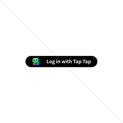
Don't
Do not put spaces within TapTap
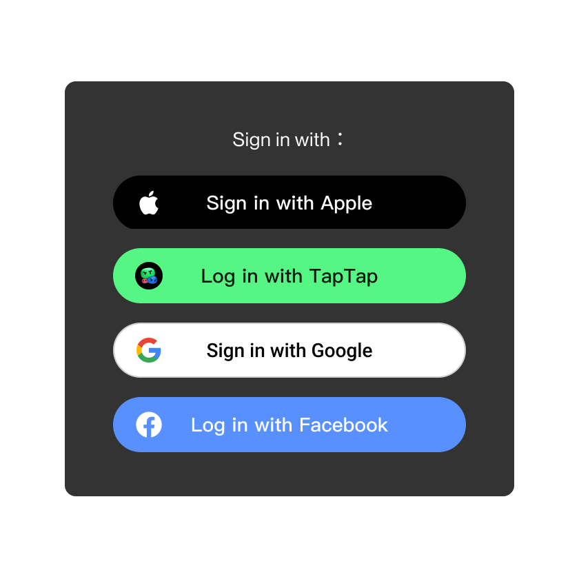
Colour rules for login portal
Depending on the background color of the game interface, you can choose from one of the two default colors: black and the brand color (green).
Black
Use this style on a light background that has enough contrast to allow the text to appear in white if you are using a black background for the buttons.
Do
Use black button on light background.

Don't
Use black button on dark background.
Brand color (green)
Use this style on a dark background with sufficient contrast, with black text if using the brand color as the button's background. It is recommended to add a black circular background image under the TapTap logo to enhance the overall look.

Do
Use green button on dark background.
Don't
Use green button on light background
Rules for customization
As the TapTap Login SDK can be used in a variety of mobile games, game developers may make minor adjustments to the TapTap logo, but must maintain the brand identity of the TapTap logo. There are no restrictions on borders, backgrounds, or button text, but changes to the style and color of the TapTap logo are not allowed.
Don't
No changes to the styling of the TapTap logo allowed

Don't
The blurring of the TapTap logo is not allowed
Don't
Using the TapTap logo for China (mainland) is not allowed
Rules for the arrangement of multiple login options
The size and style of the login button's background can be adjusted to match the overall style of the buttons in the game by changing the background of the buttons to any shape, but it must be consistent with the style of the other login buttons.
Icon

Pill